
What Are Chair Caster Locks?
Chair caster locks prevent rolling rage quit. Secure your office chair in place for maximum stability and focus. 🪑🚫
2 days ago·4 min read
Loading tags...
Unleash vibrant creativity with colors that pop. 🌈 Learn how artists and designers use dynamic palettes to captivate viewers. 🎨 Boost your visual storytelling today!

Ever felt that pang of disappointment? You pour your soul into a design, creating a vibrant sunset orange, only to see it look like a dull, muddy brown on another screen. For South African artists and designers, that colour disconnect is more than just frustrating—it can cost you a client. The key to consistency isn't just talent; it's a monitor that can truly represent vivid colour palettes, ensuring what you see is what everyone gets.
Most general-use or gaming monitors are built for speed, not subtlety. They prioritise refresh rates over colour precision, which is great for landing headshots but not so great for design work. Your standard office display likely only covers the basic sRGB colour space, leaving out the deeper, richer tones essential for professional creative projects.
This limitation means your work is being "clipped"—the monitor simply can't produce the colours you intended. The result? Washed-out visuals, inaccurate proofs, and that awkward conversation with a client about why the final print doesn't match the design you sent. Fortunately, getting a screen that respects your craft doesn't have to break the bank; there are some great budget-friendly monitors that offer a huge leap in colour fidelity.
To unlock truly vivid colour palettes, you need to understand the language of colour spaces. Think of them as different-sized boxes of crayons.
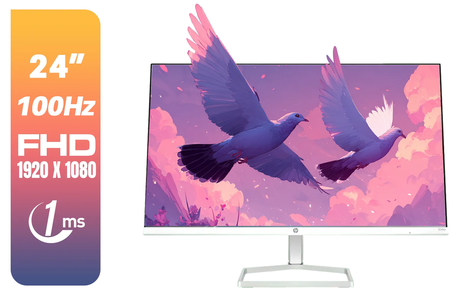
This is the smallest "crayon box" but also the most common. It's the standard for web browsers, most apps, and digital content. If your work lives exclusively online (social media graphics, UI/UX design), a monitor with 99-100% sRGB coverage is your baseline.
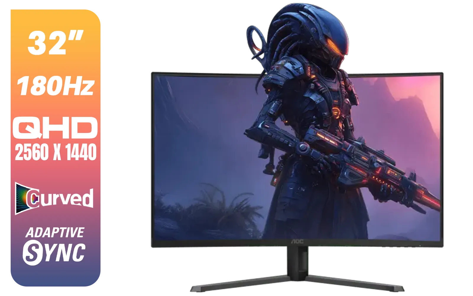
This colour space is significantly larger than sRGB, especially in the cyan and green spectrums. If you design for print—brochures, magazines, packaging—a monitor with high Adobe RGB coverage is non-negotiable. It ensures the colours you see on screen can be accurately reproduced by a CMYK printer.


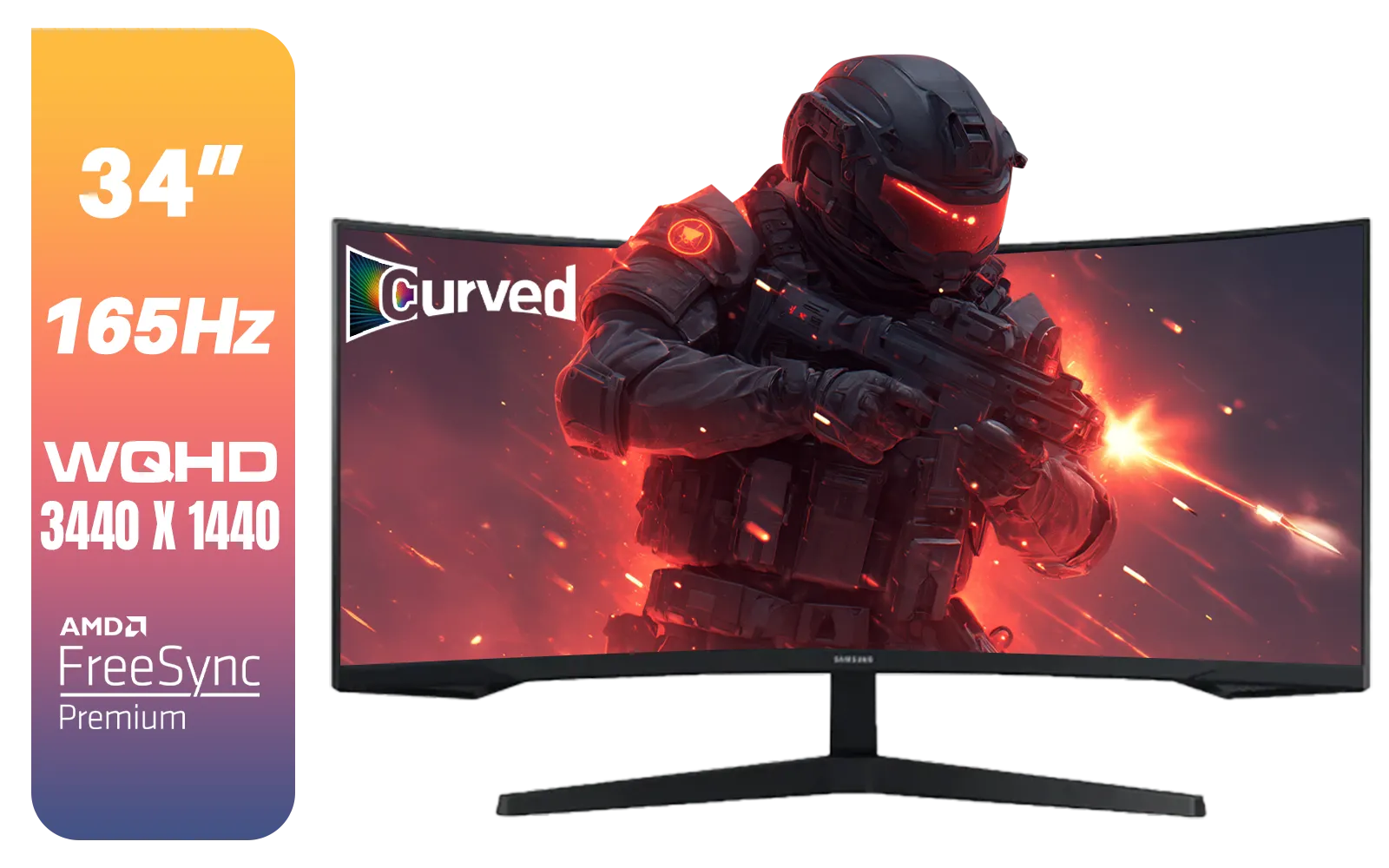
Originally developed for digital cinema, DCI-P3 is the go-to for video editors and colourists. It offers a wider gamut than sRGB, particularly in the reds and yellows, giving video footage that rich, cinematic feel. Many modern devices (like iPhones) also capture and display in P3, making it increasingly important.
Even a brand-new professional monitor can drift over time. For perfect colour accuracy, invest in a hardware calibrator. A quick calibration session once a month ensures your display remains a reliable tool for your work, keeping your vivid colour palettes perfectly consistent.
When you're hunting for a monitor that delivers vivid colour palettes, a few key specifications matter more than anything else.
Ultimately, the right monitor becomes an extension of your creative self—a reliable tool that translates your vision to the screen without compromise. Exploring our full range of PC monitors is the first step toward finding a display that truly understands colour.
Upgrade Your Creative Canvas Stop letting a dull monitor compromise your vision. It's time to work with the vivid colour palettes you intended and deliver projects with confidence. Shop our curated selection of monitors at Evetech and see your work in its truest form.


Higher chroma and contrast create popping colors. Use complementary hues for maximum visual impact.
They consider color harmony, brand identity, and emotional resonance using tools like Adobe Color.
Photoshop, Illustrator, and DaVinci Resolve offer advanced color grading tools for artists and filmmakers.
Bold monochromatics and neomorphic gradients are trending for eye-catching digital experiences.
LED displays with high color gamuts better showcase vivid tones compared to traditional lighting.
Brilliant hues energize viewers. Red increases urgency while electric blues inspire trust in visual storytelling.
Yes! Follow 60-30-10 rule: dominant color (60%), secondary (30%), accent (10%) for perfect balance.
Chair caster locks prevent rolling rage quit. Secure your office chair in place for maximum stability and focus. 🪑🚫

🚀 Disrupting the myth: Low PCIe lanes don’t doom Intel Arc A310 performance in HTPCs. Stay future-ready with power-efficient builds. 💻✨
Discover how top chair caster locks prevent rolling rage quit in gaming marathons 🎮 | Stay grounded, conquer every match!

Ensure peak performance with recline lever durability testing. Expert tips to extend double track lifespan ⚙️. Early issue detection saves costs! 💪 Read more →

🔍 RTX 4070 Ti Super leaks uncovered! Discover the rumored SA specs, performance boosts, and release timeline. 🚀 Don’t miss the tech hype—get the latest insights now!

Unlock massive power savings 🌟 with our RX 7900 XT undervolt guide. Achieve up to 50W reduction with zero FPS loss in Shadow Arena ⚡️ Boost performance and efficiency today!
🔍 RTX 4070 Ti Super leaks uncovered! Discover the rumored SA specs, performance boosts, and release timeline. 🚀 Don’t miss the tech hype—get the latest insights now!

Unleash unmatched performance with the RX 7900 XTX. 🚀 Discover how this GPU is transforming gaming in South Africa with cutting-edge tech and blazing speeds.

Looking for an affordable gaming accessory in South Africa? Take our epic quiz to discover your ideal match and level up your gameplay 💯🎮

Looking for budget-friendly gaming gear in South Africa? 💻🔥 Find out why affordable options are trending and save while leveling up!

Discover the best streaming equipment that supports virtual backgrounds 🎥 Boost your stream’s pro look with gear that powers customizable scenes 💻🔥

Discover the pros and cons of refurbished vs new laptops 🖥️. Save money without sacrificing performance. Make the smart choice today!

Discover which processor reigns supreme: ⚡ AMD Ryzen or 🚀 Intel Core? Uncover performance tips, pricing, and real-world usage comparisons.

Looking for the perfect gaming setup? Discover our top-rated budget-friendly gaming PC builds that deliver performance without breaking the bank! 💻🔥

Boost your gaming experience with top-tier components that maximize performance 💥 Optimize your build today! 🔧

Upgrade your lifestyle 💡 with our pick of smart gadgets that work flawlessly without draining your budget 💰. Top picks inside!
Chair caster locks prevent rolling rage quit. Secure your office chair in place for maximum stability and focus. 🪑🚫
🚀 Disrupting the myth: Low PCIe lanes don’t doom Intel Arc A310 performance in HTPCs. Stay future-ready with power-efficient builds. 💻✨
Discover how top chair caster locks prevent rolling rage quit in gaming marathons 🎮 | Stay grounded, conquer every match!
Ensure peak performance with recline lever durability testing. Expert tips to extend double track lifespan ⚙️. Early issue detection saves costs! 💪 Read more →

Compare the RX 7600 XT vs RTX 4060 Ti VRAM showdown in South Africa. 🔥 Discover which GPU handles higher-resolution gaming smoothly 🎮 →