Optimising a Tandem OLED Display for HDR Content and Creative Work
Quick Answer
Judge HDR and colour in a controlled room with warm viewing aids off and a colour-managed app. The 11-inch 2420x1668 Tandem OLED provides a detailed canvas, but ambient light and changing brightness can still mislead your eyes.
Decide what the display is being judged against
Creative work becomes more consistent when the viewing conditions are part of the process. Before adjusting an image, video frame or layout, decide where the finished work will be viewed: a bright office, a living-room television, a printed page, or another calibrated screen. That expectation determines whether the aim is accurate colour, readable contrast, or a deliberate creative effect.
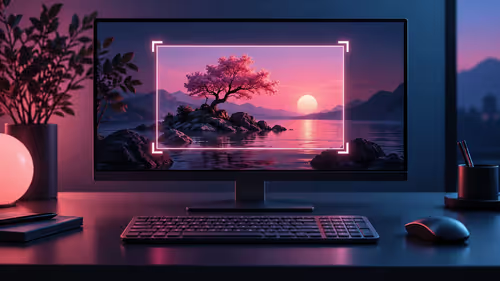
The Apple iPad Pro 11 M5 has an 11-inch Ultra Retina XDR display at 2420 by 1668 with Tandem OLED technology. Treat that resolution as room for close inspection, not as proof that a file will look identical everywhere. Other displays, room lighting and viewer settings still influence the result.
The iPad category is a useful starting point when building a portable review kit around the same class of device.
Control the room before changing the file
A screen in direct sunlight and the same screen in a dim room will invite different editing decisions. Work where strong reflections are absent and light is reasonably steady. Position a lamp so it does not shine across the display, and avoid a brightly coloured wall or window dominating the area behind it.
Turn off warm-tint or comfort-viewing features while judging neutral white, skin tones or product colours. Those features can be useful at other times, but they intentionally change the appearance of the image. Also disable any automatic setting that is visibly changing screen brightness while an important comparison is underway. The goal is not a perfectly controlled laboratory; it is a repeatable condition that lets you make the same decision tomorrow.
Give your eyes a few minutes to adapt after entering the room. Looking from a very bright phone screen to a darker editing environment can make a balanced image seem dull at first.
Use colour-managed tools for colour decisions
A colour-managed app uses the embedded profile in a compatible file to translate its colour information for the display. That is different from simply opening a picture in any viewer and trusting the first result. For approved brand artwork, product imagery or client material, keep the supplied profile attached and avoid exporting a replacement until the final intended use is known.
Make one controlled test before a large session. Open a known reference image, compare neutrals and saturated colours with the intended source, and note the app and room conditions used. If a change looks dramatic only in one app, stop before altering the master file. The issue may be the viewing path rather than the artwork.
For HDR content, confirm the delivery requirement first. HDR can preserve highlight and shadow detail, but a conversion or export for a different platform may change how the work is presented. Keep the original project file and produce a separate export for each destination instead of repeatedly re-saving one copy.
Evaluate brightness and contrast without chasing the room
Do not compensate for glare by forcing creative decisions into the file. First reduce the glare, adjust the viewing angle or move to a steadier room. Then examine a short set of images that includes shadow detail, bright highlights, neutral greys and natural skin tones. If all of them are hard to see, the environment needs attention before the grade does.
Take breaks during long reviews. Eyes adapt quickly, so an image that looked too warm after twenty minutes can look normal after a short reset. A simple before-and-after note, saved beside the project, is more reliable than memory when several people review the same asset.
An OLED monitor range can also help when a project needs a separate desk display for comparison. Compare using the same reference file and the same lighting conditions rather than relying on an impression from different rooms.
Build a repeatable review routine
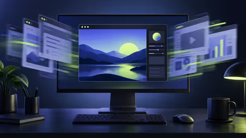
Start each review with a short checklist: clean the display, choose the usual seat and room lighting, turn off warm viewing aids, open the colour-managed application, and load the reference images. Review the work at a normal viewing distance before zooming in for detail. A small flaw that only appears at extreme magnification may not matter to the delivered experience, while a contrast issue at normal size probably will.
When handing work to another person, include the intended output, app, viewing condition and a reference frame. That gives the reviewer a useful basis for feedback such as "the midtones are too dark for the web export" rather than a vague statement that it feels wrong.
Frequently Asked Questions
Should warm viewing features be on during colour work?
No. Switch them off while evaluating neutral colour because they are designed to shift the display warmer. They can be turned back on for ordinary reading afterward.
Does HDR remove the need to manage room lighting?
No. HDR material can still be affected by reflections, eye adaptation and changing ambient light. A stable room makes the comparison more meaningful.
Why use reference images before exporting?
A known reference gives you a consistent point of comparison. It helps separate a display or app difference from a genuine problem in the creative file.
Set up a dependable creative review routine with a tablet display and workspace that make each colour decision easier to repeat.