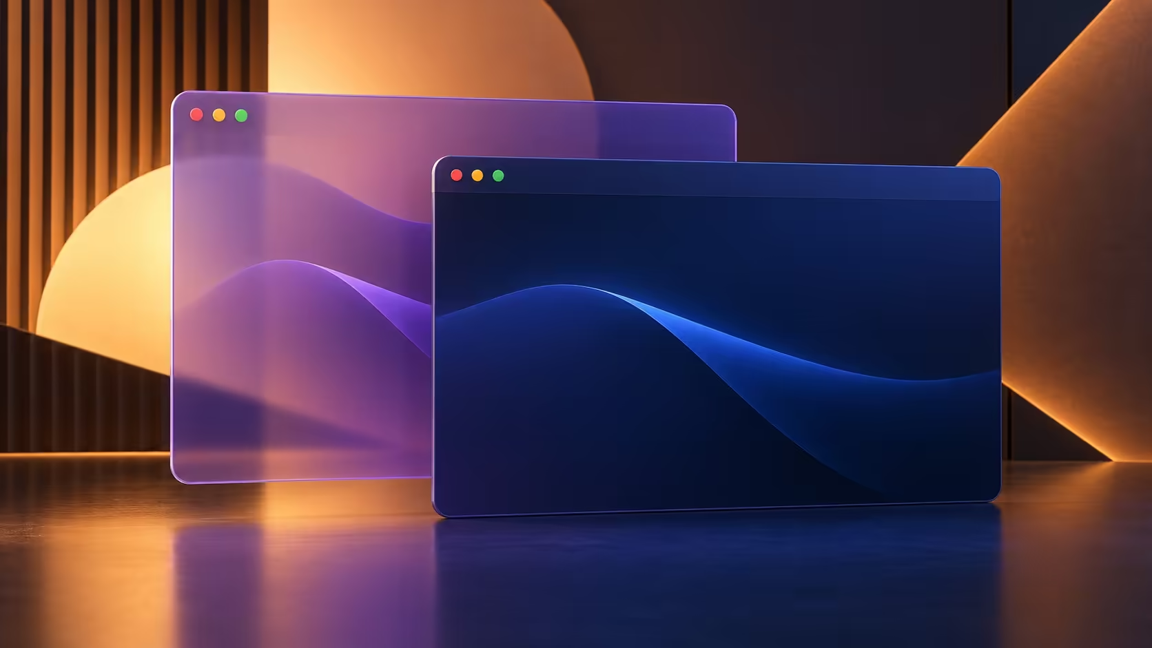
Text over a busy background can be harder to follow than the same text on a solid panel. Windows transparency effects gives you a simple appearance choice for supported interface surfaces. Try opacity first when the complaint is visual distraction, keeping your existing layout and wallpaper in place for comparison.
Quick Answer
Switch Transparency effects off in Settings, Accessibility, Visual effects, or the Personalisation colour settings. Supported backgrounds become more opaque. The choice costs R0 and can be reversed. It is a readability preference here, not a promise of better gaming frame rates or a repair for a faulty display.
🎨 Compare one surface at a time
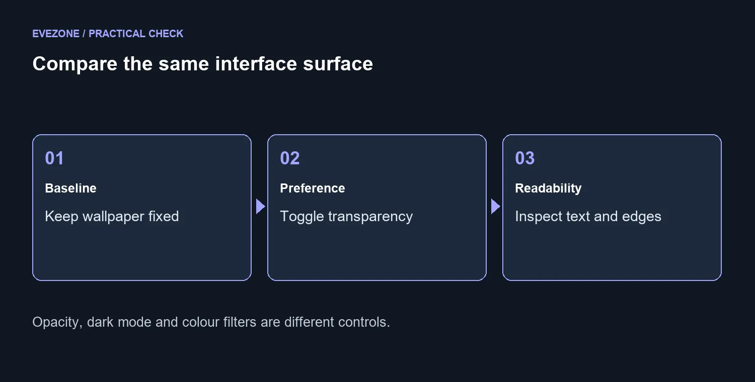
Open the same menu against the same wallpaper before and after changing the toggle. Look at the text, borders and separation from the background. Changing wallpaper, theme and transparency together makes it harder to know which choice helped.
Try the surfaces you actually use during a normal session. An attractive demonstration on an empty desktop may not tell you much about a crowded workspace. Keep the version that makes the content easier to read, even if the more transparent option looks striking in a screenshot.
🪟 Understand the scope of the preference
Applications can draw their own interfaces. A Windows appearance setting does not force every panel in every program to look identical. If one app remains unchanged, inspect that program's own appearance options before assuming the global toggle failed.
Dark mode, contrast settings and colour filters solve different problems. Change them separately if needed. Explore office monitors and gaming monitors around text comfort, desk distance and the intended work, while keeping this free preference separate from a hardware purchase.
🔎 Keep performance claims out of a visual choice
Turning off an effect should not be sold as a guaranteed frame-rate boost. No benchmark is established here. If your actual complaint is stuttering in a game, record that separately with the game and settings involved.
For readability, the useful result is simpler: can you follow the menu comfortably without the wallpaper competing with its text? Save the chosen preference and return to your normal work. If the problem remains limited to one app, take a screenshot without private content and report the exact surface. That is clearer than changing several global display controls in search of an unexplained improvement.
Frequently Asked Questions
What changes when I switch it off?
Supported interface backgrounds become more opaque. The effect depends on the app and surface.
Where is the control?
Check Settings, Accessibility, Visual effects, or Personalisation, Colours.
Is this the same as dark mode?
No. Dark or light appearance and transparency are separate preferences.
Will it improve every game frame rate?
No performance increase is promised here. Choose it for readability and appearance.
Why do some apps still look unchanged?
Applications can draw their own interfaces. A Windows preference does not force every app to use the same visual style.
How do I make a useful comparison?
Keep the same wallpaper and menu open, change only transparency, then decide which is easier to read.
Give the content a clear background
Make the menu comfortable to read. Compare opacity against the same wallpaper before changing another visual setting.