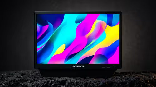
Fine pixels are wasted when menus become too small to read. Improving text readability on a 17.3-inch 4K screen means keeping native detail where practical, increasing system scale and application zoom, and placing the panel at a distance that does not invite leaning.
Quick Answer
Keep the R5,999 UPERFECT UColor J5 at 3840 x 2160, then raise operating-system scaling and programme zoom until text is comfortable at the chosen distance. Adjust the 400cd/m2 brightness for the room and consider a stable VESA position before lowering resolution, because luminance does not make tiny type physically larger.
🔍 Scale before sacrificing detail
Native 4K maps the source cleanly to the J5's panel. If menus look tiny, change scaling rather than dropping resolution immediately. This enlarges interface elements while retaining fine pixel output.
Check several applications. Some programmes handle high-density scaling differently, so one soft interface should be adjusted separately where possible. Evetech's portable monitor range helps buyers compare resolution and physical size combinations.
📐 Set distance and placement
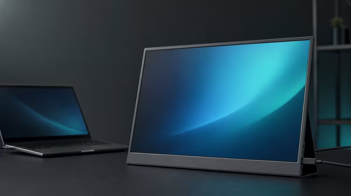
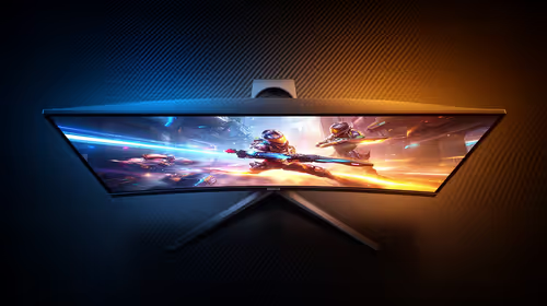
A 17.3-inch diagonal provides a larger canvas than compact portable screens, but the display still needs a sensible viewing distance. Move the panel until the full image is visible without squinting, then refine scaling.
For a fixed reading-heavy desk, VESA support can hold a repeatable height and angle. Confirm pattern, load, fasteners, and cable clearance before mounting. Evetech's monitor category provides context for permanent alternatives.
☀️ Use brightness for visibility, not size
The 400cd/m2 rating gives headroom in brighter indoor rooms. Increase output only until text remains clear against the environment. If a reflection crosses the page, change angle or lighting rather than relying on maximum brightness.
Low Blue Light can produce a warmer reading mode for extended sessions. It does not enlarge text or remove the need for breaks. Save a normal picture reference for colour-dependent content.
Evetech's monitor best sellers offer another current view while checking the J5's R5,999 figure. Test readability after reconnecting through HDMI or video-capable USB-C because a new source may apply different scaling.
Use a readability card containing the source, native resolution, operating-system scale, application zoom, distance, and brightness. Keep one card per host if the monitor moves between devices.
Check four text sizes: menu labels, document body copy, browser controls, and one older application. If only one programme appears soft or tiny, adjust it separately instead of weakening the entire 4K desktop.
Read for twenty minutes before settling on the scale. A configuration that looks spacious at first may encourage leaning later. Increase physical text size until posture remains neutral across a real task.
Brightness should be assessed after scale because larger, readable letters can reduce the temptation to make the whole screen brighter. Position and software size often solve different parts of the same discomfort.
Compare one page at several scaling levels and note line length, interface fit, and posture. The largest setting is not automatically best if it leaves too little workspace; the smallest is not efficient if reading slows.
Check how the source handles window movement between the laptop and J5. Different scale factors can make application size change during the move. Save the arrangement that keeps the main programme readable.
Use the 17.3-inch area intentionally. Place reference material beside the main document or keep a larger preview visible. If the extra canvas remains empty, screen size may be contributing less than expected.
After travel, rerun the text card before starting a long task. A new desk changes viewing distance and reflections, even when the source and resolution remain the same.
The R5,999 decision is strongest when native detail, scaling, and physical placement work together. Sharp pixels alone do not guarantee comfortable reading.
Finish by checking the smallest interface element used in a normal day: a spreadsheet formula bar, editing control, browser tab, or menu label. If it remains clear without leaning forward, the scaling choice is doing its job. If not, increase scale or application zoom before sacrificing the panel's native detail.
Frequently Asked Questions
Why does text look tiny at 4K?
The high pixel density can render interface elements physically small when the operating-system scale is too low.
What should change before resolution?
Increase system scaling and application zoom, then reassess at the normal viewing distance.
Can brightness make small letters larger?
No. It can improve visibility in the room, while scale and distance control physical readability.
How can a VESA arm help?
A compatible arm can hold a stable height, distance, and angle once its mechanical and cable requirements are confirmed.
Ready to keep 4K sharpness without living with miniature text?
Compare Evetech's portable monitor options and match resolution, size, scaling, and positioning to your reading-heavy work.