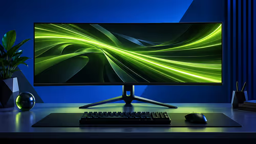
Text can feel unfamiliar on an OLED desktop even when games look exceptionally crisp. The issue is often the interaction between OLED text rendering, the panel's pixel structure, operating-system smoothing, scaling and viewing distance. The R10,999 ASUS XG27AQDMG begins from a 27-inch 2560x1440 WOLED canvas, so improvement starts at native QHD.
Quick Answer
Use native 2560x1440, run the operating system's text-tuning tool, choose comfortable scaling and keep monitor sharpness near a neutral value. The R10,999 XG27AQDMG is a gaming-focused 240Hz WOLED display, yet careful desktop setup can make documents, browser text and application labels more comfortable.
🔤 Understand why edges can look different
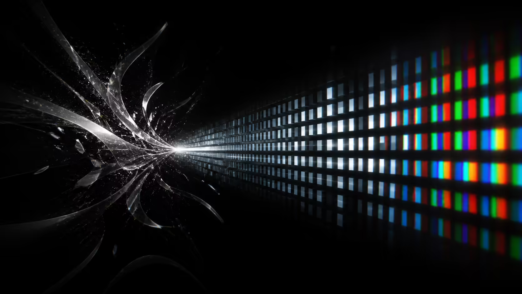
Text smoothing is designed around assumptions about how coloured subpixels are arranged. An OLED panel can present those elements differently from a familiar LCD, so high-contrast letter edges may show a subtle fringe or an unusual softness at close range.
That does not mean the whole image lacks detail. Game textures, photos and video use broader shapes and colours than a one-pixel text edge. Diagnose letters with ordinary documents at normal desk distance rather than magnified phone photographs.
Evetech's OLED monitor range gives context for buyers considering text, contrast and motion together.
🧭 Establish native QHD and sensible scaling
Select 2560x1440 in display settings. A non-native resolution forces scaling across the panel and can soften every character before text rendering is considered. Confirm the correct monitor if several displays are connected.
Next, choose an operating-system scaling level that produces a comfortable physical text size. Larger scaling is preferable to moving the screen too close or increasing application zoom inconsistently. Sign out or restart applications that do not immediately adopt the change.
🛠️ Tune text without creating halos
Run the system's text-smoothing calibration and select the samples that look clean from the usual seat. Do not perform the test while leaning close to the panel. Recheck a browser, a document editor and a code or spreadsheet view because each uses different font sizes and weights.
Leave monitor sharpness around its neutral position initially. Excessive sharpness can outline letters with bright halos, while too little makes the whole desktop soft. Change one step, read several paragraphs and return to neutral if the adjustment helps one font but harms others.
The gaming monitor catalogue helps compare pixel density and size if text comfort shares equal weight with gaming speed.
🪑 Fix the physical reading environment
Position the screen directly ahead and at a distance where the full 27-inch image is easy to scan. Harsh reflected light reduces apparent contrast around thin strokes, so move a facing lamp or control direct daylight.
Use a separate desktop picture profile with comfortable brightness and an SDR white level suited to the room. The 240Hz mode can remain active for fluid scrolling, while HDR should be enabled only for compatible tasks rather than forced onto every document.
The model's advanced heatsink and OLED burn-in protection support mixed use. Screen sleep and varied windows remain sensible during long working days. Buyers exploring a different physical shape can browse curved monitor choices, though curvature does not solve text rendering by itself.
Test whole workflows, not one font
Read a dense article, move through a settings panel, scroll a spreadsheet and inspect small browser tabs. A setting that remains comfortable across those tasks is a better final choice than one tuned to a single bold sample.
Record resolution, scaling, text-tuning choice, sharpness and viewing distance. If a software update changes appearance later, this baseline shows which part actually moved.
Check application rendering independently
Browsers, office programs and creative tools do not always draw text in exactly the same way. If one application looks unusual while the rest of the desktop is comfortable, check that program's zoom and rendering options before changing the whole monitor profile. A global sharpness change can improve one narrow case while making every other interface harsher.
Font weight also changes perception. Very thin grey text on a dark background exposes edge colour more readily than a larger white heading. Test the combinations you use most rather than selecting a setting from one deliberately difficult sample.
For a multi-monitor desk, match physical text size rather than assuming one scaling percentage suits every panel. Move a document between displays, adjust scaling per screen and reopen any application that holds the old value. This reduces the visual jump when work crosses from an LCD side screen to the 27-inch WOLED.
Finally, keep the desktop care routine separate from readability. Auto-hide and sleep reduce persistent exposure, while scaling and text smoothing improve legibility. Each control should solve its own problem.
Check text across more than one application
Compare a browser article, a spreadsheet grid and the operating-system menu at the same native QHD scaling. Different fonts and rendering engines can make one application look less comfortable than another. Adjust system scaling and viewing distance before creating an extreme sharpness preset for a single program. A balanced setting should keep several everyday text styles readable while preserving the monitor's gaming picture.
Frequently Asked Questions
Why can OLED text edges look unfamiliar?
The panel's pixel structure can interact differently with text-smoothing methods designed around common LCD arrangements, especially on fine high-contrast edges.
What resolution should I use for the clearest starting point?
Use the monitor's native 2560x1440 QHD mode. Non-native output adds full-screen scaling that can soften letters.
Can operating-system scaling improve reading comfort?
Yes. It enlarges interface and text elements without changing the panel's native pixel map, making it preferable to sitting too close.
Should I raise monitor sharpness to its maximum?
No. Excessive sharpness can add halos and harsh outlines. Begin near neutral and make small changes from the normal seat.
Does screen distance affect perceived text quality?
Yes. Very close viewing exposes individual edge behaviour, while a practical 27-inch desk distance lets characters blend more naturally.
Is the XG27AQDMG intended only for gaming?
Its 240Hz and 0.03ms features are gaming-led, but native resolution, scaling, brightness and care routines support mixed desktop work.
Ready to make the desktop readable without sacrificing the panel's gaming strengths?
Compare Evetech's QHD OLED monitors, then tune resolution, scale, text smoothing and seating distance as one complete reading system.