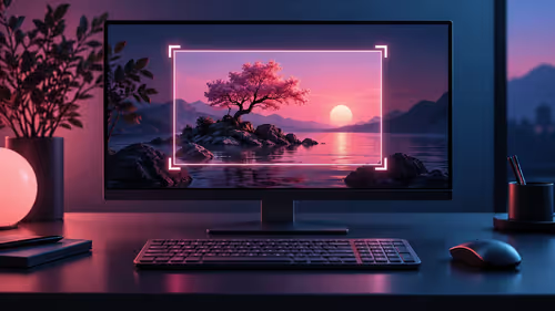
Eye-comfort labels can look interchangeable on a product page, yet they deal with different parts of the viewing experience. Flicker-free low blue light anti-glare features work best when each is matched to a real problem instead of treated as a blanket promise.
Quick Answer
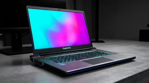
Flicker-free technology targets backlight pulsing, low blue light changes the panel's spectral output, and anti-glare coating diffuses reflections. These features solve different comfort problems, so combine them with suitable brightness, scaling and viewing breaks. At R3,199, the Lenovo L16 has a 16-inch IPS panel plus TUV Rheinland certification for Flicker Free and Low Blue Light, but desk setup remains decisive.
💡 Know what flicker-free backlighting changes
A display makes light with a backlight behind the panel. Some brightness-control methods rapidly vary that backlight, creating modulation that certain users notice as discomfort during extended work. Flicker-free technology aims to reduce that pulsing, especially at lower brightness levels where the issue can become more noticeable.
It is not a claim that the screen is harmless at any brightness, distance or task length. A very bright white page in a dark room can still feel tiring, and small text can still cause forward posture. Treat flicker-free as a useful baseline, then set the display for the room rather than leaving it at a default percentage.
The Lenovo L16's certification is relevant for a panel that may travel between home desks, offices and study spaces. Set it to native 1920x1200 resolution and use scaling that makes text comfortable before deciding whether the backlight is the source of a problem.
🌗 Use low blue light without losing the task
Low blue light refers to the balance of light wavelengths produced by the display. A cooler-looking white can be uncomfortable for some people in the evening, while a warmer setting may feel easier for reading. Hardware low blue light changes the panel output; operating systems may also offer a software colour adjustment for later hours.
Use colour adjustments thoughtfully. When editing photographs, matching brand colours or reviewing a design, return to the intended colour profile and check the result in neutral light. When reading an article, writing an email or working in a document late in the day, a warmer setting may be perfectly appropriate. The feature has value because it gives an option, not because one colour temperature is ideal for every job.
Track the symptom rather than the marketing term. If the issue is dry eyes, a warmer panel may not solve it; breaks and conscious blinking may. If the issue is a harsh-looking screen at night, lower brightness and a warmer setting are worth testing together.
🪟 Treat anti-glare as reflection management
An anti-glare coating diffuses reflected light, reducing the mirror-like effect of a glossy surface. It is useful beside windows and ceiling lights, but no coating can erase a bright reflection positioned directly behind the viewer. Start by opening a white page, identify what is reflected in the panel and change the geometry: turn the desk, tilt the screen or move the lamp.
The L16's IPS display is specified at 300 nits. In an ordinary indoor room, adjust brightness until a white document is readable without looking much brighter than the surrounding wall. If a window washes out the screen, moving the panel away from the direct line of reflection often achieves more than pushing the slider to maximum.
Raising brightness to beat a reflection can make the screen feel more intense while leaving the reflected object visible. Fix the reflection first, then fine-tune brightness.
📏 Add scale, distance and breaks to the plan
Put the screen near an arm's length away, then increase text scale until ordinary reading does not cause a forward lean. The 16:10 panel can show more vertical content than a 16:9 portable display, but that benefit is lost if the interface is compressed into tiny type. Align the screen with the task that receives the most attention and tilt it towards the eyes rather than the ceiling.
Every 20 to 30 minutes, use a natural task boundary to look across the room for a short period. That changes focus distance and is more likely to happen consistently than an elaborate schedule. If discomfort persists, keep a brief note of lighting, brightness, scale and duration. It helps separate glare, posture and dry-eye patterns.
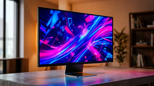
Compare office monitors when the workspace is fixed, or portable monitors when the panel must work in several rooms. The best choice depends on where the light and desk constraints actually are.
🧪 Run a controlled comfort check
Work for fifteen minutes with a comfortable font size and no direct reflection. Change only one item for the next fifteen minutes: brightness, screen angle or colour setting. If changing the angle helps immediately, glare was a major factor. If reducing brightness helps in a dim room, the issue was likely contrast with the environment. If neither helps, inspect distance and posture before assuming the display feature is at fault.
Separate the symptom before changing a setting
Use a white document for a short controlled trial. First remove a direct reflection, then set a readable scale and moderate brightness. If the discomfort changes immediately when the panel is tilted, reflections were the main issue. If it improves after a warmer late-day profile, blue-light balance may have mattered. If neither helps, check posture and distance. This sequence makes the L16's comfort certifications useful rather than treating them as a single cure-all during extended reading sessions.
🧭 Choose the first adjustment from the symptom
The obvious response to an uncomfortable screen is often to lower brightness, but that is not always the useful first move. A display that feels dim only when daylight reaches it has a reflection problem; lowering its brightness makes the document harder to read. Move the light source or alter the panel angle before changing the slider. A screen that feels sharp in a dark room is different: reduce brightness until the page no longer dominates the room, then test a warmer profile if the task is ordinary reading.
Small text is another separate decision. Increasing brightness will not fix a person leaning towards the panel, and a low-blue-light setting will not make dense interface controls easier to see. Raise system scaling or application zoom first, then keep the Lenovo L16 far enough away for relaxed shoulders. If comfort improves after one change, leave the other settings alone for that session. That produces a setup based on the actual cause instead of several simultaneous changes with no clear result.
Frequently Asked Questions
Does flicker-free mean I never need a break?
No. It targets backlight behaviour, while eyes and posture still benefit from regular changes of focus and position.
Is low blue light the same as anti-glare?
No. Low blue light concerns the screen's light spectrum, while anti-glare concerns reflections on the panel surface.
Should I use warm colours for colour-critical work?
Use the colour profile required by the task when accuracy matters. A warmer setting can be more suitable for general reading later in the day.
What should I change first when I see a reflection?
Change the screen angle, lamp position or desk orientation before increasing brightness.
Ready to make display-comfort settings do useful work?
Match the screen feature to the problem, then tune the desk around readable text and controlled light.