

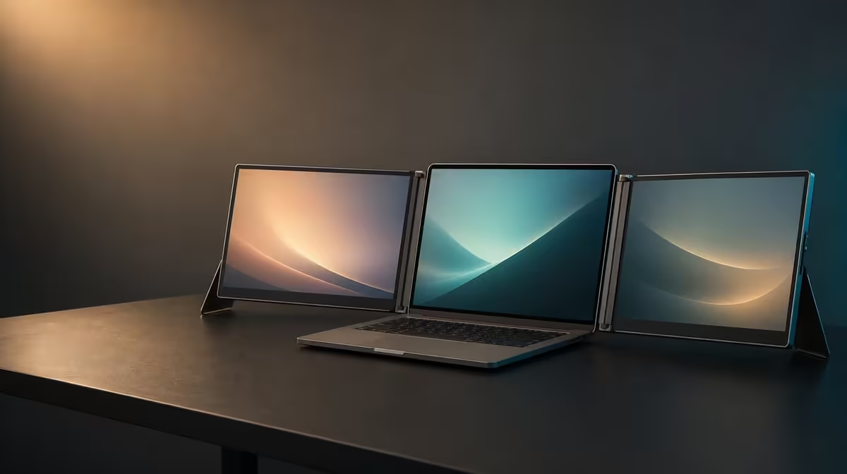
Two crisp panels can still produce a tiring day when controls are tiny, brightness overpowers the room or the laptop sits outside a comfortable viewing arc. A better dual QHD eye-comfort setup preserves native detail while making text, touch targets and the complete workstation easier to use.
Quick Answer
Set both Delta Pro Touch panels to 2560 x 1600, increase interface scale until text and controls are comfortable, then match brightness to the room. The R11,999 monitor covers 100% sRGB, but that colour-gamut fact does not replace sensible distance, posture, lighting or regular breaks.
🔎 Make QHD readable
Open the documents, browser pages and application panels used for long sessions. Keep native resolution on each 16-inch screen and change operating-system scale or application zoom instead of making the interface artificially dense. Tap the smallest recurring controls to confirm that they are comfortable as well as visible.
Include the laptop display if it remains active. It can use a different readable scale, but windows should cross between screens without sudden size changes that disrupt work.
Evetech's portable-monitor range provides options for mobile workspaces; every choice still needs to be viewed from the real seating distance.
☀️ Fit brightness to the room
Open a mostly white page on both Delta panels and adjust them so neither dominates the surrounding light. Change the screen angle before raising output to overcome a reflection. Check again later in the day because the room, not the sRGB figure, sets this comfort problem.
Place one familiar image on both screens after the reading test. The 100% sRGB coverage is useful for sRGB-oriented creative work, yet it does not prove calibration or guarantee that different brightness choices will look identical.
🪑 Arrange the whole laptop workspace
Use the ergonomic stand to keep the dual panels stable and within an easy viewing arc. Watch for leaning, chin lift or repeated twisting between the laptop and the furthest screen. Move the complete arrangement before trying to solve posture through display controls.
Direct input adds reach to the equation. Touch tools and menus for several minutes and check whether the working hand remains relaxed. Evetech's PC-monitor category offers fixed-display context when most long sessions occur at one desk.
⏱️ Validate comfort over time
Work for at least one representative block with the chosen scale, brightness and application layout. Note squinting, missed targets and panels that sit outside the comfortable zone. Take regular breaks and focus away from the screens rather than treating any monitor setting as a substitute.
Repeat the reference page after the laptop wakes or the workstation moves. Save separate notes for long reading and colour-aware tasks when their useful settings differ.
Use Evetech's monitor best-seller selection as a current comparison point for the R11,999 package. Verify availability before purchase.
Give each panel a visual role
Place long-form reading on the screen closest to the natural line of sight and move intermittent reference material to the other. Keep frequently touched controls within an easy reach rather than at the far edge of the second panel.
Observe whether the laptop screen pulls attention away from the main work. Dim or close content that has no active role, while keeping necessary notifications where they can be seen without constant scanning.
Use a three-reference comfort check
Keep one small-text document, a familiar sRGB image and a dark interface available. Reopen the same set after a room-light change or a move to another desk. It provides a stable basis for scale, brightness and reflection decisions.
Test for ten minutes, then look at a distant object and return to the normal seated position. If the user immediately leans towards text or misses touch targets, the chosen setting still needs adjustment.
Avoid treating colour settings as eye care
A different colour profile may change the appearance of the screen, but it cannot correct poor distance, glare or an awkward panel height. Preserve any colour-critical configuration and solve physical discomfort through layout and lighting first.
For long creative sessions, restore the reference pack before final decisions. Comfort adjustments should not silently replace the intended sRGB workflow.
Frequently Asked Questions
Why keep 2560 x 1600 instead of lowering resolution?
Native QHD retains intended detail while interface scaling can enlarge text and controls.
What does 100% sRGB say about eye comfort?
It describes gamut coverage, not brightness, viewing distance, posture or break habits.
How should two panels be positioned?
Keep both within a comfortable viewing and reaching arc beside the laptop.
Why test touch targets?
Readable text can still leave controls too small for accurate direct input.
What should happen during long work blocks?
Use comfortable settings, change posture and take regular visual breaks.
Ready to make dual QHD detail comfortable for the whole session? Compare Evetech's portable monitors with readable scaling, room light and your complete laptop position in mind.