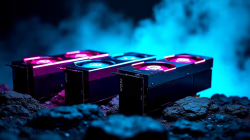
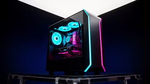
There is a specific mistake that shows up in almost every first attempt at a lit PC build: every accessory gets set to full brightness, every colour gets applied evenly, and the finished interior ends up looking curiously flat despite genuinely expensive lighting hardware. A single visual focal point, deliberately brighter than everything else in the case, is usually what a build is actually missing rather than more lighting.
Quick Answer
Lighting every component at the same intensity flattens a build's interior, since nothing draws the eye anywhere in particular. A single brighter element - typically a lit cable cover or a row of fans - gives the composition somewhere to lead the eye. Smaller accessories like the memory cover and the M.2 cover work better dimmed as supporting elements than competing at full brightness with the main feature.
🎯 Why equal brightness reads as flat
The human eye is drawn to contrast, not to brightness on its own. A case where every lit element sits at the same intensity gives the eye nowhere in particular to settle - the whole interior registers as a uniform glow rather than as a composition with a clear subject. This is the same principle a photographer or a room designer relies on: a space lit evenly everywhere tends to feel less interesting than one with a deliberate highlight and areas of relative shade around it, even when the total amount of light is similar in both cases.
Applied to an AsiaHorse-equipped build, that means a case running a lit cable cover, a lit memory module, a lit drive and a row of lit fans all at identical brightness and similar colour intensity is working against itself. Every element is technically visible, but none of them reads as the point of the build - and that is very different from a case where one element is clearly the feature and the rest support it quietly.
🌟 What makes a strong focal element
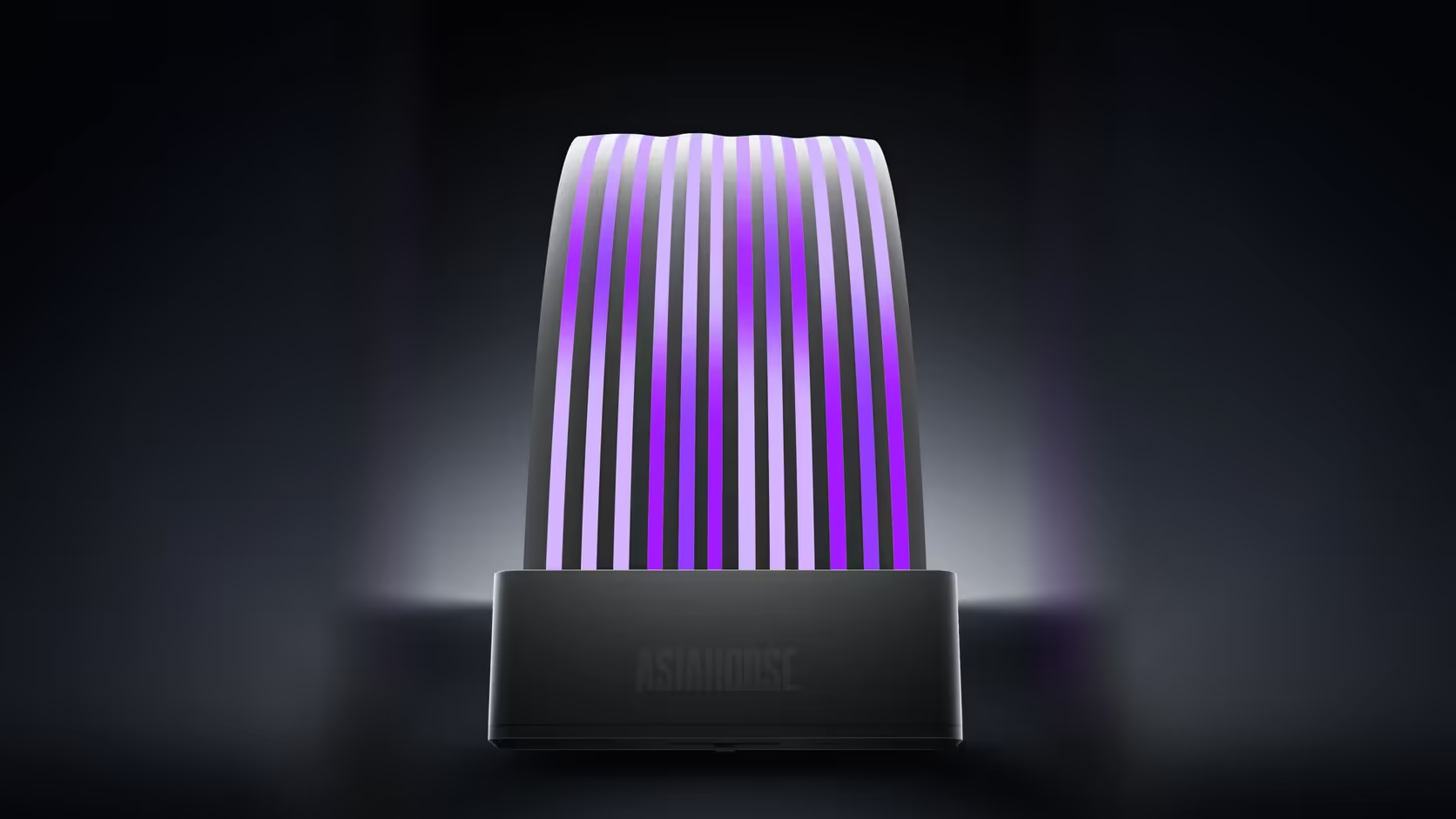
A focal element needs to occupy enough physical space to genuinely draw attention, which rules out the smallest accessories in the range by default. A row of fans spans the width of a fan wall and moves - both size and motion are strong visual cues. A lit cable cover, particularly the Aurora kit's 205mm 24-pin shell with more than 80 addressable LEDs styled as individually glowing strands, occupies a similarly substantial span down the length of a visible run. Both of these give the eye a large, continuous area to land on, rather than a small isolated point.
By contrast, the memory cover and the M.2 heatsink are both compact, single-slot accessories - useful, attractive on their own terms, but simply too small in a full case interior to carry a composition the way a fan row or a cable run can. That does not make them worse products; it makes them better suited to a supporting role than a leading one.
🎚️ Achieving the contrast in practice
The mechanism for actually creating this hierarchy is brightness control rather than product selection alone. Most boards' RGB software, and the ASH-S1 hub's own remote with its ten brightness levels, allow individual zones or devices to be dimmed independently of one another. Setting the chosen focal element - a cable cover or a row picked from the case fan range - to its full intensity while dialling the memory and drive covers down two or three notches is often enough on its own to establish the hierarchy, without needing to change which products are fitted at all.
🎨 Colour matters less than brightness for this effect
It is tempting to assume that colour variation is what creates visual interest, but a single consistent colour at varying brightness levels tends to read as more deliberate than several different colours all sitting at the same intensity. A build running one hue throughout - dimmed on the supporting elements, full brightness on the focal one - looks like a considered design choice. The same colours spread evenly at equal brightness looks more like every accessory was simply switched on and left at its default setting, regardless of how carefully each individual colour was chosen.
🔦 The focal point does not have to be lit at all
It is worth stating plainly that a focal point does not require ARGB lighting to work. A striking cooler, a distinctive graphics card shroud, or simply a bold cable colour from a sleeved kit can serve exactly the same compositional role as a lit accessory, drawing the eye without drawing any power at all. A build using a coloured braid from the sleeved extension range as its visual anchor, with modest or no addressable lighting elsewhere, can look just as intentional as a fully lit case - the principle is about contrast and hierarchy, not about how much lighting hardware is installed.
🧘 The case for restraint
There is a genuine argument that a build with two well-placed lit elements and an otherwise tidy interior outperforms one with six accessories all competing for attention. Restraint is not the same as under-lighting a build; it is choosing deliberately which one or two elements carry the composition and letting everything else recede into a supporting role. That is a harder discipline than simply lighting everything available, but it consistently produces the more photographed, more admired result - the difference between a case that looks assembled and one that looks designed.
Anyone planning this kind of composition is better served starting from the case accessories range with a specific focal element already chosen, rather than buying broadly and hoping the hierarchy emerges on its own once everything is fitted.
Frequently Asked Questions
Why does equal brightness across every component flatten a build?
Because nothing stands out from anything else, leaving the eye no clear path through the interior and reading the whole case as a uniform glow.
What makes a strong focal element in this range?
A fan row or a lit cable cover, both of which occupy a substantial span rather than a single point and can genuinely carry the composition.
Which parts work better as supporting elements?
The memory cover and the M.2 drive cover, whose smaller lit areas suit a secondary role rather than competing for the main focus.
How is the hierarchy actually created in practice?
Through brightness settings, since board RGB software or the hub's remote can dim supporting elements well below the chosen focal one.
Does colour matter as much as brightness for this effect?
Less than expected - one consistent colour at varying brightness levels reads more deliberately than several colours all sitting at equal intensity.
Can the focal point be an unlit component instead?
Yes. A distinctive cooler or a bold cable colour from a sleeved kit can draw the eye without any addressable lighting involved at all.
Is restraint ever the stronger design choice?
Frequently - a build with two well-placed lit elements and a tidy interior often reads as more deliberate than one running six at once.
Designing a build with one clear lighting feature?
Browse Evetech's case accessories to choose a focal element before deciding what everything else should support it with.