Contrast is a relationship between light and dark output, not a universal image-quality score. What a 1500:1 contrast ratio means is that the tested bright level is fifteen hundred times the tested dark level under the measurement conditions.
Quick Answer
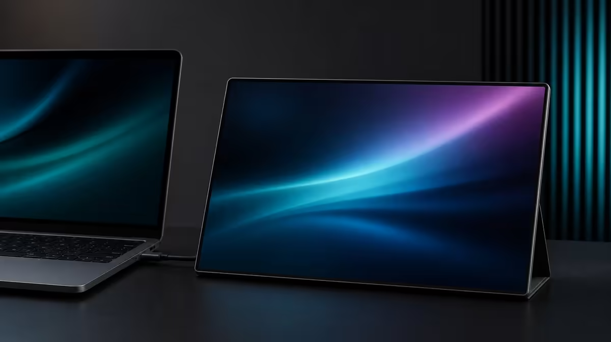
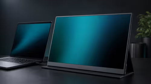
On the R2,399 UPERFECT UFree V, 1500:1 describes the panel's measured bright-to-dark relationship. It can support readable text and stronger image depth, while picture mode, 350cd/m2 brightness, reflections, content and viewing position still determine what the user sees.
🌓 Translate the ratio carefully
A ratio has no unit because it compares two luminance measurements. At 1500:1, the brighter measurement is 1,500 times the darker one within the test method.
That statement does not reveal the exact black level or working brightness on its own. Different measurement conditions, picture modes and room environments can change the practical result.
Do not turn the ratio into colour accuracy, dynamic range certification or a guarantee that every dark scene will look identical. Those are separate claims requiring separate evidence.
Compare portable screens through Evetech's portable monitor range, using consistent source material and room light rather than ranking the largest number automatically.
📄 See how contrast helps text
Dark letters on a light page rely on clear separation. Set the UFree V to native 1920 x 1080, select comfortable scaling and use a neutral picture mode.
Open a page with black, grey and coloured text. Check the thinnest letter strokes and muted interface elements, not only bold headings. A non-native resolution can blur edges even when contrast is strong.
Set brightness to suit the room. White backgrounds at the full 350cd/m2 level may feel harsh in dim conditions; lowering luminance can preserve comfortable separation.
Move window and lamp reflections away from the 15.6-inch panel. Ambient light can lift the apparent dark areas and make the ratio less visible to the eye.
The UFree V's 178-degree viewing specification supports side visibility, but centre the screen for the text reference. Angled viewing adds another variable to the judgement.
🎬 Test image depth without clipping
Use a stepped black test pattern. Adjacent dark patches should remain distinguishable instead of merging into one block. Then examine near-white steps so bright detail is not lost.
Change one picture control at a time and keep the original value. Increasing contrast controls too aggressively can clip one end of the range rather than improving the panel's physical contrast.
Open a familiar film scene containing shadow, midtone and highlight information. Compare in the actual viewing room. A vivid preset may create an initially striking image while hiding detail.
The 125% sRGB figure addresses gamut coverage. It can broaden available colour, but it neither raises the contrast ratio nor proves tonal accuracy. Keep colour and luminance observations in different rows.
For creative work, use calibrated and managed tools when delivery matters. The 1500:1 claim remains useful context but does not replace measurement of the working display.
Evetech's complete PC monitor category can frame contrast against fixed-panel alternatives in controlled rooms.
🧪 Create a repeatable panel check
Use the source's documented working display route and record its output mode. A mismatched range or unusual source setting can make blacks grey or crush them, so establish the signal baseline before changing panel controls.
Save the monitor picture mode, brightness, source device, input and room condition. Reopen the same text and tonal patches after a restart.
Repeat from the normal dual-screen position. If off-axis placement reduces perceived depth, rotate the foldable stand rather than compensating with extreme picture settings.
Check during daytime and evening use. The ratio printed on the specification remains the same, while ambient light changes what the user perceives.
For general work, value contrast by legibility and comfortable separation. For entertainment, value retained shadow and highlight detail. For colour work, include calibration and application management.
At R2,399, the UFree V combines the 1500:1 figure with Full HD IPS, broad gamut and useful brightness headroom. The complete result should be described through these tested roles, not condensed into "higher contrast always means better."
Review Evetech's current monitor favourites with the same source image when making a live comparison.
Create a contrast worksheet with five observations: black level, near-black separation, midtone clarity, near-white detail and text readability. None of these rows should be replaced by the single ratio.
Run the worksheet at the daytime and evening brightness profiles. A result that changes significantly may reveal the room or picture setting rather than a different physical panel capability.
Check the source's output range and picture mode before moving the monitor contrast control. A mismatch upstream can compress tonal information before it reaches the UFree V.
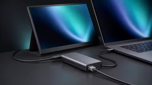
Use the same USB-C or Mini HDMI path for every comparison. If the route changes, record it and repeat the baseline rather than merging results.
For dark media, examine whether shadow objects remain distinct without turning blacks grey. For white documents, keep faint grid lines and interface controls visible without making the page harsh.
Ask another viewer to describe the dark steps from the normal side position. If the result weakens, rotate the folding stand towards the viewer rather than overcorrecting the central image.
Clean reflections from the room before panel adjustments. A bright shirt, window or lamp visible on the display can raise perceived dark levels even while the measured ratio remains unchanged.
Save one neutral profile for troubleshooting. Experimental entertainment modes can then be compared and removed without losing the known text-and-tonal baseline.
After a month, compare the worksheet rather than memory. Consistent observations are useful ownership evidence; a dramatic impression from one new film is not.
The 1500:1 figure belongs in a complete R2,399 value statement alongside Full HD clarity, gamut, brightness, inputs and support. It should never be the only reason the image is called good.
Add a source-content check before diagnosing the display. A compressed stream, lifted video master or low-quality image can contain weak blacks that no panel setting should try to invent.
Compare local test material and the problematic content through the same route. If only one file appears flat, preserve the neutral monitor profile.
Keep application playback controls at known values. A video player's enhancement mode can change shadow and highlight handling independently from the UFree V.
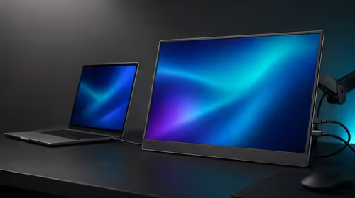
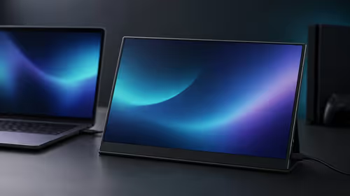
For a second-screen workflow, drag the same tonal pattern between laptop and portable panel. The goal is not perfect matching but understanding which screen is being used as the reference.
Store a screenshot of source settings and a photograph of the room layout. Together they explain more than a contrast slider number copied without context.
Frequently Asked Questions
What is the basic meaning of 1500:1?
It means the measured bright output is 1,500 times the measured dark output under the test conditions.
Does contrast ratio describe colour accuracy?
No. Gamut, calibration and measured colour error are separate.
How can contrast help text clarity?
It can strengthen separation between letter strokes and their background when native resolution and scaling are correct.
Why do room reflections matter?
They add visible light to dark areas and can reduce perceived separation.
Should brightness be maximised for contrast?
No. Choose a level suitable for the room and preserve detail at both ends.
How does 125% sRGB relate?
It describes colour-gamut coverage, not the panel's bright-to-dark ratio.
How much is the 1500:1 UFree V?
The UPERFECT UFree V costs R2,399.
Ready to see contrast in real text and shadow detail?
Compare Evetech's portable displays and test the UFree V with native pixels, neutral settings and a controlled reflection path.