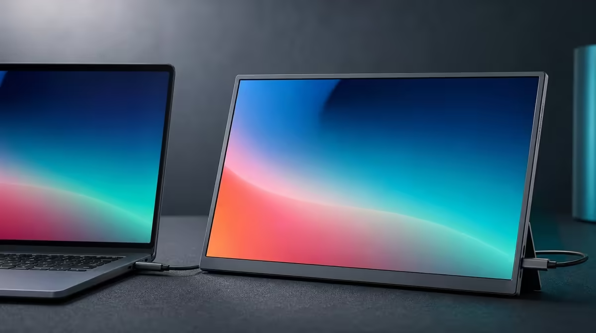
Blurry text on a compact display is often a configuration problem, not a lack of pixels. Improving text clarity on a 15.6-inch FHD screen begins at native resolution, then uses scaling, viewing position and room-matched brightness to make the pixel grid readable.
Quick Answer
Set the R2,399 UPERFECT UFree V to its native 1920 x 1080 resolution, choose comfortable operating-system scaling and view it near the centre. Its 1500:1 contrast and 350cd/m2 output can support readable text, but brightness cannot repair non-native resolution or poor application scaling.
🔢 Restore native pixels
Open display settings and identify the UFree V. Select 1920 x 1080 and apply the recommended orientation.
Avoid lowering resolution simply to enlarge menus. Interpolation can soften letter edges because the source pixels no longer map cleanly to the panel grid.
Confirm the USB-C or Mini HDMI route remains stable before tuning. Evetech's portable monitor selection can frame other native-resolution choices.
🔎 Adjust scaling and applications
Increase system scaling until body text can be read without leaning forward. Sign out or restart an application if it does not redraw cleanly.
Check a browser, document editor and the exact work program. Some older applications handle scaling differently, so one clear menu does not prove the full workflow.
Keep font smoothing and application zoom at sensible defaults first. Change one layer and compare the same paragraph.
👀 Centre the viewing position
Place the foldable stand so the panel faces the user rather than relying on the 178-degree viewing specification from an extreme angle.
Use a comfortable distance where the full 15.6-inch screen remains visible. A side display can be rotated towards the chair to keep glyph shapes consistent.
The Evetech PC monitor range is useful when comparing the same text task on larger fixed panels.
🌓 Balance contrast and light
The 1500:1 ratio can help separate dark text from a light background, but a vivid picture mode or clipped whites can reduce nuance. Start neutral.
Set brightness below the 350cd/m2 ceiling when the room allows. Move reflections first; excessive output can make white documents uncomfortable without sharpening them.
Test after a restart and save resolution, scaling, application zoom, stand angle and brightness. At R2,399, the UFree V is clear when the entire setup is reproducible.
Review Evetech's popular displays only through the same readability sample.
Create a reference page containing small and large body text, bold headings, thin grey interface labels and coloured links. Use that identical page after every adjustment.
Check the operating system's display arrangement to ensure scaling is being changed for the UFree V rather than the laptop. Two screens can use different comfortable values while retaining their native resolutions.
Move the reference page between panels. If it redraws poorly in one application, close and reopen that program before judging the monitor.
Inspect cable stability during the text test. A brief signal loss or renegotiation can leave the desktop in another mode, which makes later softness look like a panel problem.
Use the foldable stand to hold a repeatable distance and angle. Looking down a steep side position can make fine letter strokes harder to judge even with the stated wide viewing capability.
After choosing the final setup, read for a full work block. Note whether the user still leans forward or increases application zoom. Comfort during sustained text matters more than a sharp screenshot.
Save one line containing resolution, scaling, application zoom, picture mode, brightness and stand position. That combination, not 1080p alone, is the practical clarity profile.
Ask another user to open the reference page at the saved settings and read the smallest intended text from the normal chair. Agreement shows the profile describes a reproducible workspace rather than the original user's memory.
Recheck after reconnecting through the other input if both USB-C and Mini HDMI will be used. Preserve the same resolution and scaling so the source route is the only meaningful change.
Frequently Asked Questions
Which resolution should be used first?
Use the UFree V's native 1920 x 1080.
When should scaling be adjusted?
Adjust it after native resolution is set, when text or controls remain too small at a comfortable distance.
How does contrast affect text edges?
Useful bright-to-dark separation can make letters easier to distinguish from their background.
Can brightness solve blurred text?
No. It changes light output, not pixel mapping or application scaling.
Why does viewing position matter?
Centred placement gives a more consistent view of text, colour and contrast.
Should a lower resolution be the first fix?
No. Lowering resolution can soften text through interpolation.
How much is this Full HD example?
The UPERFECT UFree V costs R2,399.
Ready to make every letter land on the native pixel grid?
Browse Evetech's portable screens and tune the UFree V from 1080p through scaling, stand angle and room light.