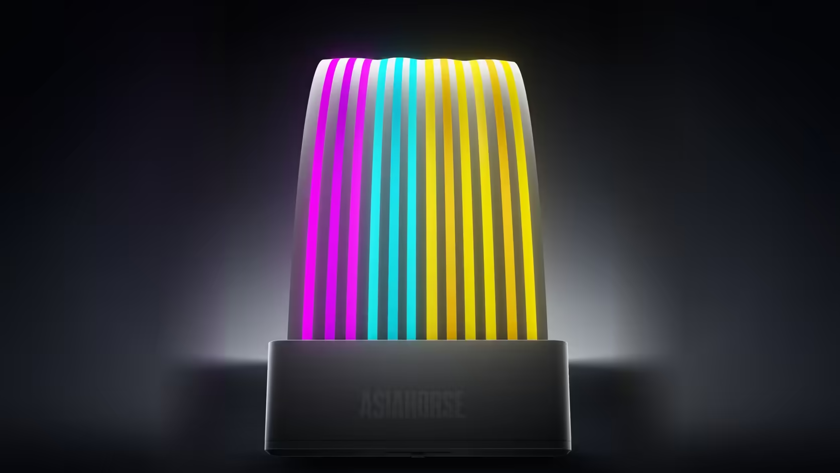
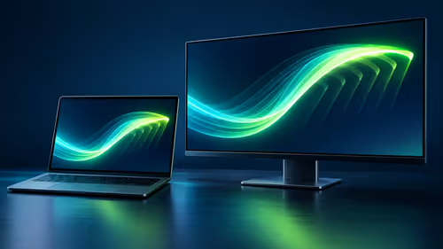
Setting the exact same colour on two AsiaHorse accessories and watching them come out looking noticeably different is not a fault to chase, and reaching for a replacement over it usually solves nothing. A colour diffusion mismatch between devices comes down to how each one's lit surface actually spreads that signal, not how accurately either one received it.
Quick Answer
Devices with different lit surfaces produce visibly different results from the identical software colour setting, because diffusion and brightness genuinely vary between designs - a large diffused cover behaves differently from a small concentrated panel even when both are told to display the same colour. This is not a fault in either accessory. Adjusting brightness per device individually is the practical way to bring two mismatched products closer together visually.
🎨 Why identical settings produce different results
A colour signal sent to an addressable device gets physically expressed through whatever LEDs and diffusion material that specific product uses, and those two things vary considerably across a lineup that spans a 108-LED cover down to a five-LED drive heatsink. The signal itself is identical between devices; what each one does with it, physically, is not - and that difference is what your eyes actually pick up on when comparing two products side by side.
Is any colour calibration claimed across the range
No colour calibration between different products is claimed anywhere in this range, so visible variation between genuinely different items is an expected outcome rather than something pointing at a defect in either one.
📏 Where the difference shows up most
The largest visible gap tends to appear between products with very different lit surface areas - comparing something like the Aurora Learn cover's 108 LEDs spread across a wide diffused shell against the M.2 heatsink's five LEDs on a small concentrated panel shows the starkest contrast, simply because the physical scale of the lit area differs so much between the two.
🔧 Bringing devices closer together
Adjusting individual brightness per device, where the lighting software allows it, is the practical correction available - it will not make two genuinely different lit surfaces identical, but it narrows the gap considerably by compensating for how much brighter or more diffused one product naturally reads compared to another.
Does the shell colour itself contribute
Yes - a white shell diffuses and lightens whatever effect is showing, producing a softer, paler appearance, where a black shell gives stronger contrast against the same underlying colour signal, which is worth factoring into any comparison between differently coloured products.
🤍 Would matching products avoid this entirely
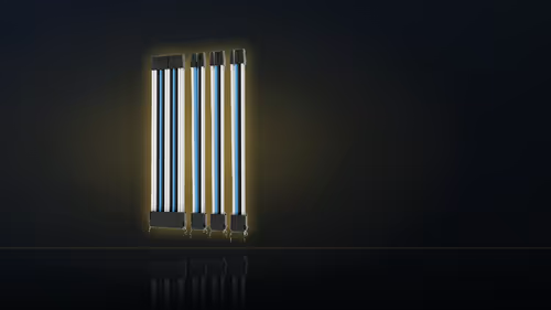
Within a single product family the variation is far less noticeable, since similar devices share similar lit surface designs - a reasonable argument for choosing matching products where several devices sit directly side by side in view. Case accessories that support a coordinated lighting look are in the case accessories category, with cable routing in the cable solutions range.
Is the mismatch worse in certain colours
Whites and pale tones tend to show the variation most clearly, since small shifts in diffusion or brightness are considerably more visible in those subtle tones than they would be in a fully saturated, bold colour.
Frequently Asked Questions
Why do two devices show different colours from an identical setting?
Because their lit surfaces differ - a large diffused cover and a small concentrated panel produce genuinely different visual results from the same underlying signal.
Is this actually a product defect?
No colour calibration is claimed across the range, so variation between genuinely different products is expected rather than a sign either one is faulty.
Where does the difference show up most clearly?
Between products with very different lit surface areas, such as comparing a 108-LED cover directly against a five-LED drive panel.
Can the mismatch actually be corrected?
Partly - adjusting brightness per device individually, where the software allows it, brings the perceived colours noticeably closer together.
Does the shell colour itself play a role?
Yes - a white shell diffuses and lightens the effect, while a black shell gives stronger contrast against the exact same colour signal.
Would sticking to one product family avoid the mismatch?
Within a single family the variation is far less noticeable, which is a reasonable argument when devices sit visibly side by side.
Is the mismatch worse for some colours than others?
Whites and pale tones show the difference most, since small shifts are considerably more visible there than in fully saturated colours.
Trying to get a coordinated look across several AsiaHorse devices?
Browse the case accessories range for matching products and cable solutions for tidy routing between them.