The question of OLED or LCD on Googlebook is more useful when it starts with the screen in front of your eyes than with a technology ranking. Deep blacks matter for films, but fine text matters for documents. A display that looks impressive in a launch image can still be the wrong fit for your lighting, scaling preference or editing workflow.
Quick Answer
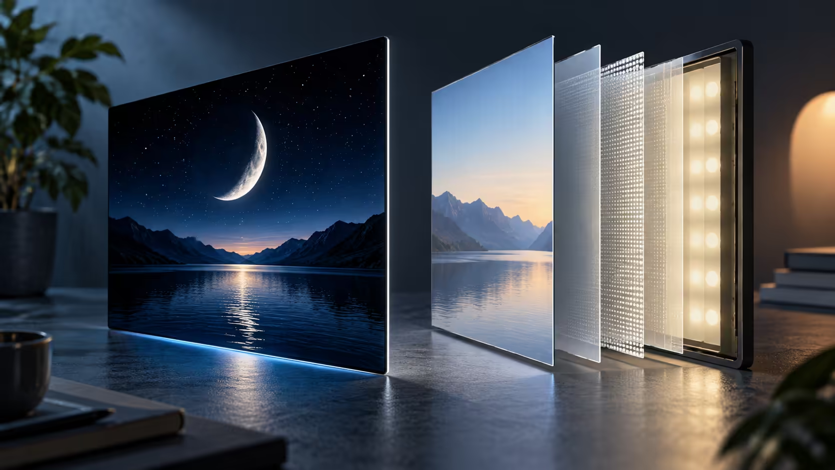
OLED offers pixel-level light control, while LCD uses a separate backlight. Those differences influence contrast, but reading comfort and editing accuracy also depend on the exact panel, reflections, brightness behaviour, scaling and colour management. In the published Googlebook lineup, XPS uses LCD and the other four model listings describe OLED.
💡 Understand the light source without overreading it
An OLED pixel emits light directly. Reducing its output allows dark areas to remain dark beside brighter content. This can create strong contrast and convincing dark scenes, especially in a dim room. The result is one reason OLED is prominent in premium portable displays.
An LCD controls light from a backlight. Its ability to show dark and bright content depends on the panel and illumination system. The category contains many different implementations, so the word LCD is not itself a complete quality judgement. A good individual panel can suit a reader better than a different technology with less comfortable behaviour.
Brightness claims need context too. A brief highlight in a small area is not the same workload as a bright document covering most of the screen. For everyday buying, the question is whether the display remains readable in the environment where it will be used. A single peak figure cannot describe every image and lighting condition.
Panel technology alone cannot rank outdoor visibility, response behaviour or sustained brightness between the five machines. Compare measurements for the exact model and display configuration, ideally alongside a demonstration in lighting similar to your workspace.
🔤 Treat text as its own display test
Documents, spreadsheets and browser pages contain thin lines and small repeated shapes. Their clarity depends on resolution, scaling, font rendering and the physical structure of the panel. A high-resolution label does not guarantee that every person will find a particular font equally comfortable.
Evaluate a normal page of text at the size you would actually use. Include black text on a light background and the dark theme you prefer. Look at punctuation, fine diagonal strokes and coloured text as well as large headings. The goal is comfortable reading, not finding the smallest setting that can technically be deciphered.
Viewing distance changes the calculation. A compact laptop close to the eyes can feel different from the same panel positioned farther away with an external keyboard. Decide how the machine will sit in the working setup before treating its diagonal as a complete ergonomic answer.
For current laptop comparisons, keep a short note on reading needs beside each screen specification. Someone who spends most of the day in documents may value stable, comfortable text over dramatic film contrast. Another buyer may divide time equally between reading and visual media. Neither preference requires declaring one panel technology universally superior.
🎨 Editing needs a complete colour workflow
A wide or vivid colour presentation is not the same as accurate colour. Editing relies on the selected display mode, calibration and colour handling in the software. If an application ignores or misinterprets the intended profile, the panel alone cannot correct the workflow.
Begin with the destination of the work. An image prepared for common web viewing has different practical requirements from a project delivered through a tightly specified print process. The useful display setting should support that destination rather than simply making the preview look as saturated as possible.
The Googlebook app edition matters here as well. A familiar creative-tool name may refer to an Android or web implementation with different controls from a desktop application. Confirm the features that affect your process, including export format and profile handling. A technically capable screen does not add missing software options.
An external display may be part of the answer for a fixed workspace. Browse monitor categories and popular models around the colour and connection requirements of that workspace, then verify output support for the exact laptop. Do not infer multi-display capability or a particular resolution from the connector shape alone.
👀 Comfort and long-term use remain model-specific
Reflections can make a bright screen difficult to read in the wrong position. A window behind the user or a strong overhead light may matter more than a small difference in a published brightness figure. The practical response is to evaluate the intended seating and lighting, not just the panel in an ideal demonstration space.
Brightness-control methods can also affect comfort. Some displays vary light output in ways that sensitive users notice, especially at particular settings. It would be misleading to label every OLED as uncomfortable or every LCD as flicker-free. The exact panel and its control behaviour need evidence.
OLED ownership also raises questions about long periods of static content. General care guidance should come from the manufacturer for the specific device; do not invent a lifetime prediction or assume an unrelated laptop uses identical protection. If static dashboards dominate your routine, make that use pattern part of the model evaluation.
A useful demonstration file contains ordinary paragraph text, a dark photograph and the kind of fine interface controls used in your applications. Compare the same material at similar brightness instead of judging one laptop from a colourful film and another from a plain desktop. Keeping the content consistent makes your own comfort judgement more meaningful.
The final choice can be made in a sensible order: readable text, suitable reflections and brightness, the required colour workflow, then the media experience you enjoy. Googlebook offers more than one display technology, which gives buyers room to choose according to use. A technology label is the beginning of that assessment, not its conclusion.
Frequently Asked Questions
Which launch Googlebook uses LCD?
The XPS Googlebook listing specifies LCD; the published Acer, ASUS, HP and Lenovo listings describe OLED.
Why can OLED show deeper blacks?
An OLED pixel can reduce its own light output, unlike an LCD pixel using a separate backlight.
Does OLED guarantee accurate editing colours?
No. Calibration, the selected colour mode and colour-managed software still matter.
Is pixel resolution enough to judge text comfort?
No. Scaling, font rendering, pixel structure and viewing distance can change how text looks.
Should every OLED panel be called flicker-free?
No. Brightness-control behaviour is panel-specific and requires manufacturer detail or measurement.
Pick the panel your eyes and projects need
Compare laptop and monitor options at Evetech with reading comfort, room lighting and colour workflow in mind.